Web Insights

Accessible Content Authoring

The power to keep your website accessible is in your hands — follow this simple guide to help maintain accessible content on your website.

Include proper alt text for images

Not only is alt text important for SEO, it’s crucial for accessibility. The alt attribute is meant to provide "alternate text" descriptions of images to help ensure people do not miss out on information conveyed by graphics. Alternative text can help people using assistive technology, such as screen readers, or people who have images turned off on their mobile devices (to save data, for instance).

The alternative text describes the primary purpose of an image and is rarely a detailed description of the image itself (unless, for example, the page is actually about a specific image).

When uploading new images into your content management system (CMS), it’s important to get into the habit of adding a distinct title and alt text, especially for images that are used as more than decoration.

Here are some quick tips:

  • Describe the image as specifically as possible.
  • Keep it (relatively) short.
  • Don't begin alternative text with "photo of..." or "picture of..."
  • Don't put line breaks in alt text.
  • Emotion is important.

Here are some examples:
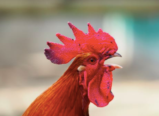
Okay alt text:<img src="bird.png" alt="Rooster">
Better alt text:<img src="bird.png" alt="Rooster crowing">
Best alt text:<img src="bird.png" alt="Red-crested rooster crowing">

Okay alt text:<img src="escalator.jpg" alt="man on escalator">
Better alt text:<img src="escalator.jpg" alt="man walking on escalator">
Best alt text:<img src="escalator.jpg" alt="man wearing backpack walking down escalator">

Ensure infographics, diagrams and charts are screen-readable

Using dynamic content such as infographics, diagrams and charts is a great way to help convey key information in a visually-engaging way but we need to be careful that these meet accessibility guidelines as well as not getting lost to users using screen readers.

Here are some quick tips to help:

Ensure all images used follow accessibility guidelines, especially in the areas of colour contrast and text size.


When using rasterised image formats like JPG, PNG or GIF, ensure either:

  • Sufficient alt text is included so no information is missed
  • The information provided in the image is also included in screen readable page content


Use inlined SVG images which allows for an easily scalable image size, but also allows for text that can be read by a screen reader. Remember to consider the following:

  • Embed fonts in the SVG to ensure browsers display the image correctly. (You may need some developer help to make this work.)
  • Add custom title and description text. This can be done directly in the SVG code but should also be enabled as an option in the content management system. The description could simply be a text version of the chart/infographic, or it could be a one to two sentence description of an image.

Use captions and transcripts for video and audio

Videos and audio are fantastic communication tools to enhance your website content. To ensure they’re effective, they need to be delivered with accessibility in mind. Captions, transcripts and audio descriptions work together to ensure all users will be able to access your content.

Here are some quick tips:

  • Include captions/subtitles for video
  • Include an audio transcript for video
  • Include a text transcript for video and audio
  • Consider using sign language in a video presentation
  • Vimeo and YouTube are both good video embedding platforms which allow you to meet the accessibility requirements

Note: Some videos may be used in the background with no words or sound - these may not require captions and descriptions.

Use headings correctly for structured content

Having a well formed content structure for your website is vital for usability, searchability and accessibility. Good use of headings, subheadings, paragraphs, lists, tables and images will ensure your content is visually readable as well as by a screen reader.

Here are some quick tips to help you get started:

Use a structured hierarchy of headings. Your content management system will allow you to use a range of headings from 1 through to 6. These are great visual indicators to how to read through content. They also help screen readers navigate through sections of content as well as search engines understand your website. W3 Web Accessibility Tutorials have some great examples of what this can look like.

Heading 1 - Main Heading

Heading 2 - Sub Heading

Heading 3 - Sub Sub Heading

Heading 2 - Sub Heading

Heading 3 - Sub Sub Heading


Use short sentences and paragraphs. You know what it’s like trying to read a really long article which seems to be all in one paragraph - our eyes struggle to focus. Shorter sentences and paragraphs make your content understandable and accessible to all users, in particular for people with learning or cognitive difficulties.

Ensure your content has a logical flow.
A simple tip that’s useful for all users. Ensure your content walks your users through your content in a clear and logical manner - using headings to designate different sections and ensuring the flow leads to helpful and relevant call to actions.

Use Colour with Care

When used correctly, colour can greatly assist good usability on a website. Due to how it’s perceived by different sets of users, it’s important to use it carefully.

Users with visual-impairments such as blindness, low vision, colour blindness or colour deficiency are prevented from understanding a messaged conveyed only through the use of colour. This can also apply to instances where devices have low colour contrast, are monochrome or are being used in circumstances where colour is harder to see (like outdoors with sunlight). On the other hand, users with other disabilities such as learning or cognitive may benefit greatly from colour in content and design.

  • Use other visual indicators alongside colour to distinguish content: asterisk, question mark, underline, italic, bold, whitespace, borders
  • Evaluate colour contrast to ensure accessibility standards are met. Use helpful tools to check colour contrast:
    • ColorZilla is a free browser extension for Firefox and Chrome
    • Pika is an open-source colour picker for MacOS
    • Web AIM is an web based colour contrast checker


❌ Examples: Low contrast ratios that don’t meet WCAG Compliance for AA

1.4 : 1
Colour contrast
1.52 : 1
Colour contrast
2.15 : 1
Colour contrast
3.18 : 1
Colour contrast


✅ Examples: High contrast ratios that meet WCAG Compliance for AA

5.53 : 1
Colour contrast
5.75 : 1
Colour contrast
5.81 : 1
Colour contrast
7.71 : 1
Colour contrast

Note: If text and background colors are swapped, the contrast ratio remains the same.


This document is based on the guidelines provided by the Web Content Accessibility Guidelines (WCAG). The WCAG defines how to make web content more accessible to people with disabilities. Read more about the WCAG here.

Why Web Accessibility?

We believe that it’s vital to be designing, developing and authoring websites so that people with disabilities can use them. This means providing access for people with all types of disability - auditory, cognitive, neurological, physical, speech and visual. Websites should be able to be perceived, understood, navigated and interacted with by everyone.

We’ve put together this quick guide to help you, as the content author, create and maintain accessible content for your website.

Top Six Focus Areas

  1. Include proper alt text for images
  2. Ensure infographics, diagrams and charts are screen-readable
  3. Use captions and transcripts for video and audio
  4. Give your links unique and descriptive names
  5. Use headings correctly for structured content
  6. Use colour with care